Showing posts with label interior design. Show all posts

Tuesday, May 24, 2011

Paul Cha Architects | Union Square Loft

Paul Cha Architects | Union Square Loft
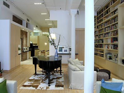
This Union Square Loft was designed by Paul Cha Architects, This 2500 SF trapezoid shaped Loft is located in the bustling Union Square area, is housed in a former department store, with original cast iron columns and tin ceilings. The client, an educational consultant, requested a tranquil residence for daily living as well as receiving frequent guests. The strategy adopted was to insert a modern intervention, clad in wood panels, operable sliding glass windows and wood louvers, into the center and thus creating a public front for the private back.

The Living Room and Study are located at the front, facing the street, while the Guest Bath, Master Bedroom and Master Bath are located at the back. Connecting the public and private realms is the Kitchen and Dining Area, which acts as a transitional space, as well as the loft's focal point.

Paul Cha Architects | Union Square Loft


Materiality, texture and coloration are orchestrated to further articulate the architectural design intention. The natural grain of the quartered ash with vertical/horizontal veneer paired with the soft porcelain tile contrasts the cool precision of stainless steel appliances and satin nickel fixtures.
Paul Cha Architects | Union Square Loft


The interior decoration further enhances the calm tranquility of the loft with carefully selected and placed furnishings. The result is a spacious yet intimate residence, overlooking the excitement of Union Square below, yet reflecting the cultured serenity of the owner above.

Paul Cha Architects | Union Square Loft


Paul Cha Architects | Union Square Loft


Paul Cha Architects | Union Square Loft

Fabbrica Restaurant by Tjep

fabbrica Restaurant by Tjep

This is a new restaurant located in Rotterdam harbor, right between the boats and the cranes, Dutch that was designed by Tjep and has been nominated for the Dutch Design Awards 2006. This cool restaurant is called Fabbrica, a new Italian restaurant. Fabbrica meaning factory in Italian, they envisioned the canteen of a very special factory: a very romantic factory where pleasure is produced for guests.

Like in the canteen of a factory you will find long tables and benches at Fabbrica, but than colored in Italian ice-cream shop style colors: pink and pistachio green. The oven is placed in a huge tank, covered with italian mosaic. A large wall composed of crane elements is use to store wood to fire the oven. Every detail combines industrial sturdiness with soft colors or decorative elements.

fabbrica Restaurantfabbrica

Tjep Designer chose not to intervene with the authentic industrial character of this nineteenth century warehouse so they left all the structures in original state. The walls for example are left intact, in several places large glass panels were placed in front of them covered with Italian wallpaper patterns. The result is that the patterns seem to float in front of the wall in a complex game of reflections. Lovers get to sit in a train structure that floats in the center of the space.


fabbrica Restaurantfabbrica new Italian restaurant

The logo of Fabbrica is based on a font in which the point on the i resembles the beautiful shape of a hand made pizza, but one can also see a full moon, as it enlightens Fabbrica at night.

Modular Office Furniture System

An office furniture system


Looking for an office furniture system that can enabling theusers to work together in a team, to enjoy dining together or to organize various activities of everyday life ..? This office furniture system could be the answer. This office furniture system has a flexible system and can be adapted to different requirements in workspaces or private areas. All elements can be combined modularly; tables can be placed as extension elements or freestanding, and cabinet elements can be modularly combined with doors, drawers or top pieces in various design types. With movable wall elements, workspaces can be divided according to individual requirements. As such, conference rooms can be flexibly arranged right next to single office spaces. This office furniture system was designed by Aksusuardi Studio and Manufactured by Nurus.

An office furniture system by Aksusuardi Studio


The bright coloring of this product line contributes to a modern stylistic ambience, which adds zest to everyday life. Details in the design like slim silver-coloured table legs or embedded silver strips indicate high-grade workmanship and additionally set effective accents.

An office furniture system by Aksusuardi Studio

Refreshing Pluk Interior Design by Tjep

Interior Design of Pluk by Tjep


A new colorful take-away restaurant that is called Pluk was designed by Tjep and offers: fresh juices, yogurt shakes and special salads that customers can compose by themselves: the so called tossed salads.

The essence of the formula is to enjoy good food. The emphasis on health is implicit. Pluk says: if you are consuming the healthy things 99% of the times, you can indulge yourselves with 1% of wiped cream. Pluk offers the 99% and the 1% next to each other, on top of each other or mixed with each other.

Pluk Interior DesignColorful Pluk Interior Design


The interior tries to reflect this juxtaposition of healthy and fun. For some reason healthy wants to look boring but we just said no! The counters contain fruits and vegetables in three color groups.

They are actually fake, but because of the way we integrated a special gradient effect the whole counter becomes simply delicious, by the way it took us months to develop the exact right color, gradient and fruit/vegetable combination to get this result: people who enter Pluk are overwhelmed and just cant resist ordering one of the wonderful specialities specially prepared by Aïda and Zeger.

Aïda & Zeger Pluk Interior DesignFresh Pluk Interior Design


These new friends came to us last year and asked us to help them out with they're dream... since the opening last June the whole Tjep. team is addicted to Pluk. Anyway if you are in Haarlem in the Netherlands check it out! Tjep. was responsible for the identity, naming and interior design of Pluk.

Sunday, May 15, 2011

The ALV Showroom Interior by Fabio Novembre

This clean white modern ALV showroom interior design in Milan, Italy is created by Italian architect Fabio Novembre with stylish white base color and pink.
The sinuous lines of the surfaces of the display units flow inside the display space, which revolves around a central fulcrum, the ‘atom’, consisting of an open, permeable, circular element defined solely by its ’skeleton’, solid but ethereal as the material it is made from, HI-MACS.

The Cave Restaurant Interior by Koichi Takada Architects

This unique cave restaurant interior design in Sydney, Australia is created by japanese based architect, Koichi Takada Architects. The restaurant interior was designed with the goal to change the way we eat and chat in restaurants. The acoustic quality of restaurants contributes to the comfort and enjoyment of a dining experience.
Description from the architects:

We have experimented with noise levels in relation to the comfort of dining and the ambience a cave like environment can create. The timber profiles generate a sound studio atmosphere, and a pleasant ‘noise’ of dining conversation, offering a more intimate experience as well as a visually interesting and complex surrounding.

The series of acoustic curvatures were tested and developed with computer modelling and each ‘timber grain’ profile has been translated and cut from computer-generated 3-D data, using Computer Numerical Control (CNC) technology.

Colorful Laundry Room Interior Design Inspirations


If you want to decorate your laundry room interior into a bright and colorful place that can cheer up your mood while you do your washing part. This cool colorful and bright laundry room inspiration might be suit for your modern stylish home interior design. This colorful laundry room interior decoration can be achieves by applying some bright color selection to your laundry appliance, wall sticker, wall painting, wallpapers or another furniture and accessories that might support in creating your laundry room looks more alive.


Here are some great colorful laundry room design and picture collection for your interior inspirations that could help you to make your own colorful laundry room. Don't forget to create an efficient laundry room design by creating some good arrangement like to arrange work surfaces, appliances and storage cabinets in the right way they suppose to be.


Modern Luxury Spa Interior Design at Five Star Capri Palace Hotel


This cool modern luxury spa interior design is the perfect part of the luxurious and spacious modern five star Capri Palace Hotel which become a perfect holiday destination with a beautiful natural beach view overlooking the Mediterranean and the Gulf of Naples in Italia.

If you are having holiday there, try to ask for Megaron Suite which is a huge penthouse with a private circular swimming pool set in a Mediterranean roof garden. Two of the deluxe rooms, as well as five of the suites, have their own private pools and gardens. If you choose a Classic room, ask for one with a sea view. It you want to spoil your body and soul with the spa treatment, try to use their spa treatment services which is specializes in leg treatments at their modern luxury spa interior design, with wonder therapies to help prevent and improve cellulite and vascular problems. Other features that you might get at this modern luxury Five Star Capri Palace Hotel are a heated swimming pool, your own private garden, five luxuriously furnished suites, guest rooms with chandeliers and marble baths and much more to come.


modern luxury spa interior design

Via Venetto Store Interior by Buensalido+Architects


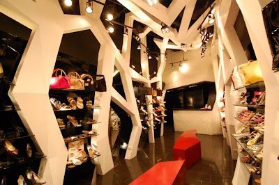
This modern retail store interior design in Makati City, Philippines was designed by Buensalido+Architects for a 30-year old shoe retail store, Via Venetto. The aim was to give the store with a new contemporary image to recapture its market. The architects tried to find a balance between maintaining some of its characteristics and infusing them with newer, more contemporary forms.


The word ‘via’ is italian for roadway, path, or walkway. These words are almost synonymous to the characteristic of ‘movement’. Translated physically, the feeling of movement was represented by a series of undulating archs that loom over you as you traverse inside the store. The experience almost becomes ceremonial. These archs were then interconnected with a myriad of beams, forming a diamond shaped faceted web. The parralelism of the diamond represents the store’s standing in the local retail community – in the same way a diamond has developed its sparkle through time, the brand attained the market’s trust thru time as well.


Saturday, May 14, 2011

The Expose Coffee Table by Alex MacMaster


The Expose coffee table is created by British designer Alex MacMaster.


Expose coffee table consists of a symmetrical 3 point intercepting leg structure which supports a toughened glass top. The core construction of the legs is cross laminated birch ply, which in the wood finishes is left exposed adding contrast and being honest to the materials used.

close
Banner iklan disini